Pages

Showing posts with label colors. Show all posts

Wednesday, August 28, 2013

Vintage Simplicity 4464


Here's a fabulous vintage pattern I found listed on ebay.  I didn't buy it though, because I haven't yet scrutinized my pattern stash for something similar.  I think I might have one or two that I could use as a starting point.  I may have to make some modifications to the style, to give it a side zip (or even a back zip), figure out what I want to do for pockets. I have a pocket style in mind, and I'm sure there is a name for it, but I don't know what it is -- think Dale Evans, and in the meantime I'll try to find a vintage photo that shows what I'm thinking about.  Another compelling reason to get this pattern is that blouse!   I love kimono sleeves, dolman sleeves, and batwing sleeves.  I find that styling to work really well with an overly generous bust, particularly if the waist is brought in with a belt, or cummerbund, as illustrated below.  And I love it used unbelted, over the turtleneck as shown in the upper right.

I'm trying to improve my blogging presentation skills. I wish I knew more about making photo collages without purchasing additional software or add-ons.  So, I've been playing around in Microsoft Paint, and reading online about how to use its features.
I wanted to put together a seasonal wardrobe inspiration board, like the ones I've seen on more visually appealing blogs, but I'm not there yet.  Here's what I have come up with so far, a basic palette.


And I even figured out how to change a color on a photographed image, and then collage the result.
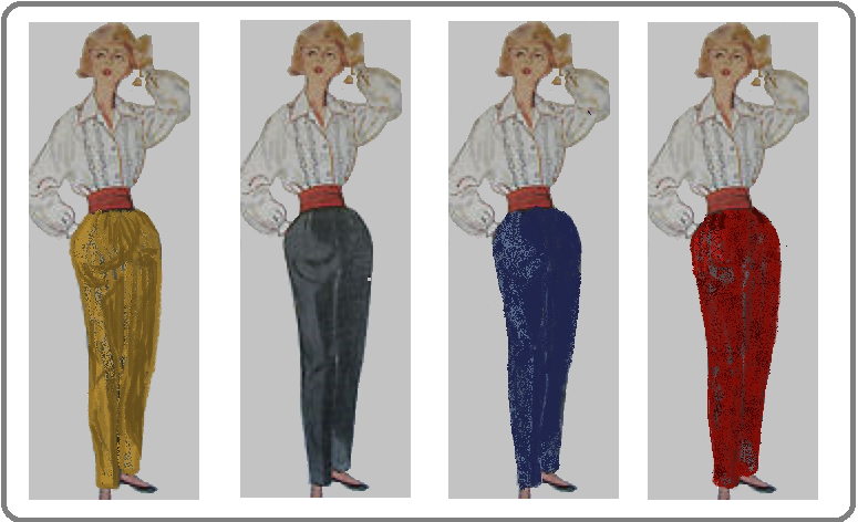

It's not the inspiration board I envision, as that is beyond my skills at this time.

I guess it's more important to to make the actual clothes, then I can photo and blog.

To undertake a Me-Made Seasonal Wardrobe project, here are the obstacles to be overcome as I see them:
1.   My sewing room needs a major decluttering and reorganization.
2.  My dress form needs a breast augmentation, and then to be covered.
3. Then she'll need a name, any suggestions?  Better yet, if you do, save them, and when I get her done, I'll celebrate with a giveaway of some sort.  I 'll have to figure out something suitable as a dress form-naming prize.
4.  I need to select my patterns, then modify as needed, and grade for size, and alter for proportion.  My figure type is an inverted triangle.  At least my overweight figure type is.  I put all my weight in my bust and around my middle.  Years ago, when I was slim, I was more of an hourglass.  I'm a little tall, (almost 5'8"), and have a longer torso, and only slightly longer than average legs.
5.  I'll need to source fabric, which may be a bit of a challenge.  There is only one fabric store in spitting distance, and I would prefer to see and touch the fabric before I buy, as I am trying to coordinate my colors pretty tightly.  I think the colors I have chosen are universal, and should be easy to find, but it hasn't been that way online, so we'll see.
6.  Then there's just the making of muslins, cutting and sewing the garments.
7.  And then the shopping for shoes and hosiery, and the accessorizing. 
8.  Then the modeling and the styling and photos and the blogging!
9. Oh yeah, I forgot to add knitting 2 or 3 Shetland cardigans (and selling my plasma to buy the wool!).  After all, I'd like to be dressed at least as well as your average Shetland pony! 

What do you think?  Am I crazy to try this with the holidays approaching?  Or is it too hard to tell, since I haven't actually quantified the scope of the project, like how many of each type of garment.  I'll work on that part of the planning next.

Thursday, March 10, 2011

Color Me Tickled Pink!

Do you know what this is? It is the exact shade of turquoise that the color experts declared as the color of the year 2010. (Who knew? No doubt more people than I count, it's just that I wasn't one of them. Well, thanks to GertieLink, this year, I am in the know. No more color obscurity (colora obscura?) for me. Color me informed! This year's Pantone color is none other than the lovely honeysuckle. And if you relish poetic colorful word pictures, you should go to their website and read the press release, where the text gives real meaning to the choice of this color for 2011. (And if you find that this topic and fashion interests you, they also intorduce the Fall 2011 fashion palette!)
Here is the official swatch:
I also recently discovered that on http://www.gorgeousfabrics.com/, the fabric details include the closest Pantone shade. This is especially good if you don't trust your monitor, and therefore shy away from buying fabrics online. We have a Pantone catalog at work, and I might just have to borrow it to work out what shades of fabric I have in my inventory. It would sure make coordinating less of a hit-or-miss deal.
How many of you can remember when it was popular to: have your colors "done"? This was usually done by a consultant who helped you characterize your personal coloring, and learn what hues and shades were the most flattering colors to wear, both in your clothes and in your makeup. I never had it done, but I am very easily categorized: I am a "Summer", fair hair, fair skin, blue eyes, and so I look best in pastels , and in general, colors with a blue-ish hue. I admit I haven't studied the prescribed colors exhaustively. It's just that I've been on the planet long enough to have accidentally observed that certain colors are really more flattering than others on me. As it turns out, I really like the way coral colors look on me, and also almost any shade of green. Most blues are fine, but it's when they have a little green in them that they really pop. I think it's because my eyes are not a clear crystal blue, but have just a hint of amber, and with my skin's natural tendency to pink up, sometimes they look almost green. I think I may be the only woman in America who doesn't wear much black -- instead my go-to color is navy blue, but I recently determined that it should be a taupe or a medium charcoal gray.


Here are 4 fabrics I recently purchased. The ribbed one on the left is a true taupe. The next one looks very much like it, and looked definitely brown-y taupe online, but was called gray! I find that in very bright sunlight, it looks gray, but in any lower light, it looks taupe, go figure. I adore the aqua print - it looks a little like a Japanese print, maybe it is? And I love turquoise with coral.That coral is a rayon knit with a "slub" texture.
I forgot about lime green! I really like lime green, which came as a surprise to me when I realized it. I think I had kind of ignored it since it was more yellow, but somehow it is still a flattering color for me. The fabrics below mainly showcase my affinity for sage green. But I really didn't get accurate colors -- it just looks so gray here. The print knit photo'd well, though. I will be cutting that out for another top like the one on the dressform the other day.The fabric on the left and on the lower right are good bottom weight fabrics , destined for skirts or slacks. The upper right one is a crinkle knit with eyelet embroidery, like broderie d'anglaise. Now, that one at bottom center is really deceiving. I really am going to try to get a better pic, real close up. It's really pretty. It looks like it is woven with yellow fibers in one direction, and green in the other. It is destined to be a pencil skirt.
The print below is a risk purchase gone wrong. This is one that doesn't look that great online, but you think that it must look better "in person". Alas, it does not. I haven't given up yet though, I will nurture it along. But I will definitely try it for a pattern that I really just need to try a "muslin" for, you know kind of like a blind date, no expectations, no emotional investment, and therefore no real disappointment if it doesn't really work out. (Who am I kidding....anyone?) The burgundy knit next to it was a failed attempt to find some plum fabric, in an effort to provide the prodigal print an environment in which she could shine. My point being that, in the event I make a garment from this print, and the pattern and the fabric are a success, then I will need to wear it with something, but I think it will be with something in sage in that event.
And I will close with the first picture of myself. As I have mentioned, I am a bit camera-shy, but this shot gives you some idea of the pale skin that I am trying not to overwhelm, and how nice coral can look alongside. This is a very fine-gauge cotton cardigan (3/4-sleeve) that I just picked up at the LLBean outlet store in Freeport. They were having a 30% off everything in the store sale, and I brought it home for $20! The scarf is a large square of silk hand-hemmed - a friend brought it back from a trip to India. At the time, I didn't wear any of the colors - she knew better than I did what I should be wearing!

Do you select your wardrobe pieces according to a color palette? Do most of the things in your closet go together, so you can mix and match new combinations at a moment's notice? I'm not fully there yet, but I do like to get a lot of mileage out of my separates.